Thanks to the awesome work of Daniel Probst, collecting per canton data and publishing it on https://github.com/daenuprobst/covid19-cases-switzerland, I was able to pull this quick heatmap together, showing latest (ie daily) confirmed cases of COVID-19 in Switzerland, updated constantly (whenever source data changes).
note: unreported cantonal data is backfilled from the previous day
I have a bunch of friends over at swisstopo and I always considered them artists – little did I know about the true level of artistry that goes into their beautiful maps:
That one contains 468 usable startLongitude/startLatitude elements, which fits nicely into kml as Placemark and renders well on https://www.google.com/mymaps.
The resulting map:
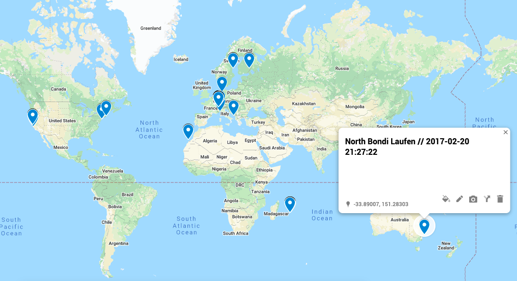
all my Garmin activities anchored in a location, plotted on a map using kml Pacemarks
Which also works well zooming in:
zoomed in view of all my Garmin activities in a specific region
Again, drop me a note if you feel I could help you with any of this.
everywhere in this world I’ve run, biked, hiked, skied, swum
Today I had some fun exporting all my recorded Garmin tracks and plotting them as a heatmap on Google Maps.
After having wanted to create a map like this for ages, I finally found some time to hack together the toolchain needed. If you want to do the same, the easiest way I’ve found was:
Alternatively, drop me a line, and I’d be happy to help 🙂
You might wonder how to plot all your tracks on a map – which is what I initially started with. However, with 346 recorded activities, using kml to plot them (through various platforms) I found it difficult to navigate the result. – If you’d like to get your fit files converted to kml to play around with them, also drop me a note, I have a converter for that too.
A close up view (without adjusting radius, maxIntensity,.. so not optimal):